Further forays, fresh flaws for fabricator fonts
October 4, 2014
Some headway to report on the geometric font project. There was an early comment by Willem Derks regarding the need to have control over stencilling. After all the focus of this project is manufacturing, meaning that we do expect people to actually cut holes into sheet material based on our strokes. Without stencilling we can end up with topologically disjoint remains (for example the insides of ‘o’, ‘8’ and ‘g’). However we decided it’s not good enough to supply a secondary typeface which has stencil gaps, as the radius of the gaps very much depends on the size of the cutter, the thickness and even the strength of the material.
On the left you can see the formation of islands when symbol strokes form a closed loop. Adding a single bridge will connect the inside of the g with the rest of the material, but it could be a very weak connection as the bending moment across the bridge can be large if the island is long. If the sheet material is strong though this is not a problem. This is why we decided to cater for both primary and secondary bridges. The font designer merely has to put points on the symbol geometry to specify where primary and secondary bridges can be made and the end-user can specify what radii to assign to each category:

Some text without any bridges. This will work fine if the text is burned or milled onto the material without cutting all the way through.

The same text with only primary stencil bridges. Strong material like thick metal sheeting should be able to handle these connections. Of course the user can specify larger bridge widths depending on the milling radius.

Both primary and secondary stencil bridges are now made. There could still be a large bending moment if the ‘islands’ have a large maximum distance to the axis between two stencil bridges.
Although stencilling is finished enough for an initial beta release, there are still problems with the kerning engine. On the whole it works reasonably well and there’s plenty of settings to control the distance between adjacent characters:
Characters can be positioned at fixed intervals (mono-spacing), based on their bounding boxes or based on their actual shapes. The kerning distance between two adjacent symbols is computed iteratively to a high degree of accuracy (which doesn’t usually take more than 3 or 4 iterations). Note that characters consist both of visible and invisible geometry.
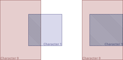
I did find that positioning symbols based on a fixed minimum distance did not always visually please. As a result I decided to add a friction curve to the kerning engine. Friction retards the intrusion of one symbol into the bounding box of another. For example two adjacent symbols can be positioned very much ‘inside each other’:

Kerning may push a symbol so far leftwards that its bounding box intersect with the box of the previous symbol. In rare cases a symbol may even be placed entirely within the previous symbols’s bounding box. For example the combination ‘C-‘ could result in very strong kerning.
A kerning friction curve lessens motion due to kerning by simulating increasing friction. The further one bounding box is pushed into another, the harder it gets to push it further. I provided both linear and non-linear friction curves, mostly because I have no idea yet what works well.
The last serious (known) bug to solve is to do with intersecting symbols. The example above shows that the text ‘3,4’ results in intersecting symbols as the comma is kerned underneath the ‘3’ and the ‘4’ is kerned over the comma. Kerning is at present purely a two symbol algorithm, which is clearly insufficient. I’ll either have to maintain a spacing front which moves from left to right as individual symbols are positioned, or I simply need to take all existing symbols into account when positioning the next one.
I can certainly see why professional typefaces often come with manually designed kerning offsets…
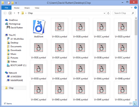
Oh and of course there’s now also proper file icons for fonts and symbols:


